Practicey - your expenses organized in a practical way
- 30 de mai. de 2025
- 8 min de leitura
Atualizado: 31 de jul. de 2025

Problem Statement
To manage their finances, people need to record their daily expenses in a practical and simple way at the time of purchase, because when they leave it to write down later, the result is usually incomplete and ineffective control.
They also need to calculate expenses to know how much they have spent so far and how much money they have left until the next month.
Challenge (How Might we)
How might we help users record all their expenses in a practical way and also organize this information as they record it?
Solution (Goal Statement)
Practicey, a financial control app, will allow users to record and calculate their expenses automatically at the time of purchase, which will help those who need to control their expenses in a practical way, allowing them to organize their purchases by categories, record the value of purchases and calculate debts.
I will measure effectiveness by monitoring monthly expenses and measuring how much has already been spent and how much is left until the next payment.
Learn more about the app by clicking here.
Production Process
Research
I started by trying to understand how users usually make their payments and discovered that 52 million Brazilians use credit cards for this, according to SPC Brasil, and the other methods used by the majority are Pix and debit.
And to learn about users' pain points, I conducted interviews with real people.
Based on these interviews, I developed 2 Personas that represent the most common information among the interviewees.


I will use this 2nd persona to show the next steps of the research, such as the User Journey with the objective of understanding the process used to record expenses on a daily basis.

Benchmarking
After getting to know users' pain points up close, I sought to find out which options are already available on the market and what they offer that is good and what needs improvement, and that is where I could find the possibilities for differentiating my product.

Ideation Process
The research phase was very important to give me a starting point based on user needs and existing solution proposals.
The next step was to start sketching possible solutions, for this I used Crazy Eights.

Crazy Eights made me start to see details of usability that I hadn't noticed before, which helped me focus on important steps broken down in the next phase, User Flows.
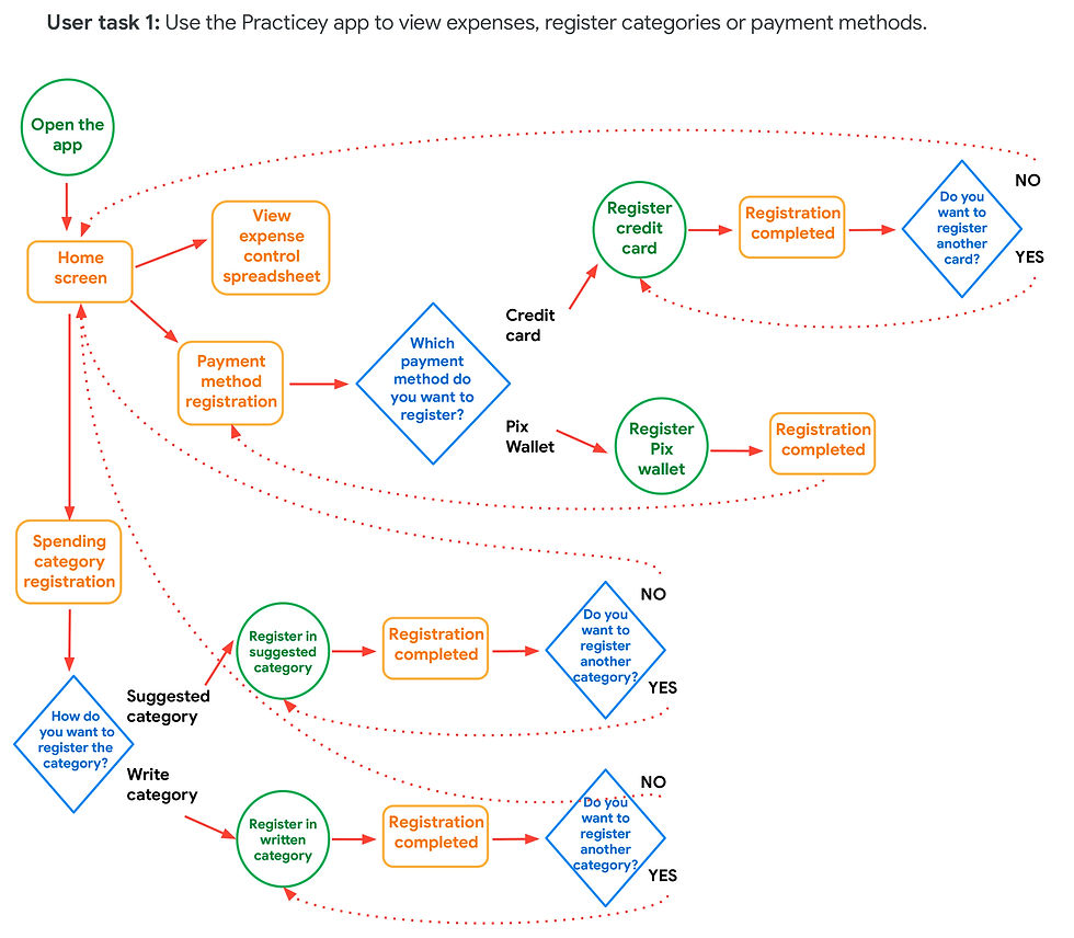
Click on each of the images below to see them in more detail.
User task 1: Use the Practicey app to view expenses, register categories or payment methods.
User Task 2: Make a type of purchase not yet categorized in the app.

User task 3: Make a purchase at the market you always visit.

Development
At this point I had a much broader vision of the app's content and functionality, so using Information Architecture and Wireframes helped me organize the elements visually.


So, turning the wireframes into a low-quality prototype was the natural next step. I used Figma to do all the prototyping and navigation functionality.

If you want to check out the low-fidelity prototype in action, click here.
UX Research
The next phases were essential for the maturation of the app, where I observed users interacting with the low-fidelity prototype and gained several insights.
Research plan
The research plan helped me choose how to conduct the interview and testing phase. In it, I defined the research questions, key performance indicators (KPIs), the methodology, the profile of the participants and the script.
If you want to see the research plan in detail, click here.
Interviews
In order to understand how people control their expenses and how my app can make this task easier in their daily lives, I interviewed 5 people: 3 men and 2 women, aged between 20 and 65.

I used the following in the Methodology:
Moderate usability studies
Sessions lasting 15 to 30 minutes each
Remote (participants in their own homes interviewed via Zoom), residents of Brazil, the United States and Australia.
Questions:
In general, how do you feel when it comes to controlling your finances?
Answer: 90% of respondents say they have no difficulty with this subject.
Do you have the habit of recording your daily expenses?
Answer: 100% of respondents record their expenses.
How do you record your daily and monthly expenses?
Answer: 60% of respondents use an Excel spreadsheet or similar, 20% use a financial control app, and 20% do not make any type of note.
What payment method do you use the most? (debit, credit, Pix)
Answer: 100% of respondents use a credit card, but 40% also use Pix a lot.
Do you have the habit of controlling everything you spend monthly?
Answer: 100% of respondents do not record all their exact expenses, only the larger and recurring expenses; smaller expenses are not recorded.
Sometimes you may forget about an expense or other and at the end of the month the bill doesn't add up. Has this ever happened to you? If so, how did you feel?
Answer: 100% of those interviewed said that this happens frequently and the feeling is usually one of frustration at having to adjust their income to cover what was not recorded.
Affinity Diagram
After seeing the interviewees carrying out some of the activities proposed in the app prototype, I gathered several impressions, feelings and quotes into affinity groups. This helped me see the points in the app that needed improvement and also many other insights that I was only able to see through the real experience of the users.

Many of the perceptions were similar, below are some quotes and insights.
"My expectation was that when I clicked on the purchase message, I would see the information right away, without having to click." - Participant B
Insight: When the user clicks on the purchase message, the main information about the purchase should be displayed on the Home page.
"I'm missing a link to return to the home screen. I see that the Spreadsheet link does this, but I think it should have a better name, like Home or Dashboard. I had the feeling that the Spreadsheet page was not the home page, but rather a list." - Participant D
Insight: Create the Home tab with information about the latest purchases and create another Spreadsheet tab with a list of all purchases.
To see all the insights identified, click here.
Iteration - 1st Round
With the users' pain points organized into affinity groups and insights, I implemented the changes and new solutions in the low-fidelity prototype.
User perception:
When I click on the message to see the expense made, I still need to click on the date on the calendar, the information should already be displayed.
Insight:
The screen already shows the information on the daily expense without having to click, in addition, the days in which there was a purchase are marked on the calendar.

User perception:
The Categories screen is a list of the categories you've created, but it could show how much you've already spent on each of them and how much you still have left.
Insight:
The Category screen shows a graph with an overview of all expenses, as well as the amount spent and the remainder of each category.

User perception:
Users feeling anxious because they don't know what stage of the task they are at, or if there is still a long way to go.
Insight:
Step-by-step instructions at the top of the screen show the user's current stage of the task.

UI Design
Before transforming the low-fidelity prototype into high-fidelity, it was necessary to develop the entire visual design of the app, so I started by defining the name of the app and the logo.
Logo

The name Practicey is a combination of two words.
One of the key words that defines the purpose of creating the app: Practical, referring to the way the app aims to control expenses.
The other word is Money, making the connection with the object that will be taken care of.
The logo is represented by the first letter of the name, but transforming the P into a dollar sign, the symbol of money. It is inside a circle divided into 4 parts, representing the organization in slices of a graph.
The logo's font is Product Sans Bold, which conveys modernity, simplicity and clarity in its sans serif forms.
Typography
For the texts, the chosen typeface was Encode Sans, a San Serif font that is easy to read, even at small sizes. Another characteristic that guided this choice was that the different font weights in this family create a good typographic hierarchy.

Colors
The choice of colors was guided by the objective of speaking to the target audience: Burgundy Red as the main color, representing youthfulness, enthusiasm, modernity, and variations of Navy Blue as the secondary color, to balance its elegance and versatility.

Iconography and components (Design kit)
Users feel more at ease when they recognize elements they have already seen on other websites and apps, so I used this approach when choosing icons and graphic elements, such as rounded buttons and floating boxes.

Final product
I arrived at the final result, a high-fidelity prototype.
During testing, I realized that it is important to indicate the different possibilities of accessing the app depending on the resource that is leading the user to access it. The options are:
Journey 1 (Happy path): User entered the app by clicking on the pop-up message received after a purchase in a registered category. You can test it by clicking here.
Journey 2: User entered the app by clicking on the pop-up message received after a purchase without registering in a category. To view it, click here.
Journey 3: User entered the app through the icon. To see this option, click here.
Journey 4: User entered the app for the first time. To learn about this path, click here.

Iteration - 2nd round
With the high-fidelity prototype in hand, I conducted a 2nd round of usability studies. By observing 5 more participants using the new version of the app, I came up with the following insights:
1st round - Insights:
Create a Home button on the main menu bar
On the Home page, display the day's purchase information without having to click
On the Spreadsheet tab, display a list of expenses in order of date
On the Category tab, show, in addition to the list of registered categories, graphs showing how much each category occupies in the monthly budget and also how much has been used so far
Whenever a task has several steps, display progress bars
2nd round - Insights
Replace the phrase "Daily expenses" with the date the expense was made
Highlight the day the purchase is being made on the calendar
Place the back button on the left side
Leave the top of the Spreadsheet table fixed
Include the text for each step of filling out the credit card
Place the flag on the credit card and show only the last 4 digits
Make the Spreadsheet table look lighter, keeping only the horizontal lines
Make it possible to mark expenses as fixed/recurring
Detail better pop-up messages that lead users to see expenses in the app
When registering a credit card, show text protecting user data
Final considerations
A valuable lesson learned was the importance of iteration, which is the action of updating the product whenever necessary to better adapt to the needs of users.
The research phase also showed me how rewarding it is to see your product solve real problems for real people, so one of the next steps is to analyze the possibility of transforming this study project into a functional app and making it available in the app stores in the future.
I am very grateful for the opportunity to learn so much during this project and the course that encouraged me to develop this app. Many thanks to the developers of the Google UX Design course - Coursera.
© 2025. All rights reserved to Leif Bessa
All | Pata amiga | Practicey | Uni-Duni-Tê | Climate Scanner | Minha grana organizada | Plenarinho 2.0 | App Sicoob