Plenarinho 2.0 - Reorganizing the website for the challenges of the new phase
- 28 de mar. de 2025
- 8 min de leitura
Atualizado: 31 de jul. de 2025

Discover the website: https://plenarinho.leg.br/
Problem
In 2017, the team that developed the Plenarinho website had a few tasks ahead of them:
Transferring its content to the new platform acquired by the Chamber of Deputies (from Zope Plone to WordPress);
Reorganizing the variety of subjects and content that had been growing since 2004;
The target audience changed. Initially, the focus was on children aged 6 to 10, but we realized that teachers were the main promoters, as they looked for useful content for their classes, created materials based on the website and directed students to complete tasks there. Another consequence of this was the increase in the age range to 7 to 14 years old due to the profile of the students who started accessing the page.
Faced with these changing needs, the Plenarinho team saw a great opportunity and transformed it into the following challenge:
How might we reorganize the Plenarinho website to make its content more accessible and attractive?
Solution
Redesign the Plenarinho website, which is its main product, adapting its layout to the demands of the target audience.
Consequently, the elements that work together with the website had to be redesigned, such as the characters and the logo.

Results
Analyzing the 1-year period since the publication of the new version, we were able to observe that Google Analytics showed an increase of almost 500% in users:

Production Process
The current scenario
To understand the current scenario, it is important to have an overview of the website's history since its creation.
The Plenarinho website was created in 2004 in the Chamber of Deputies with the aim of talking about politics in a language accessible to a new target audience: children.
The connection with the children's audience was made through the creation of Turma do Plenarinho, a group of 6 characters (Zé Plenarinho, Légis, Xereta, Cida, Adão and Edu Coruja) who carried in their characteristics subjects related to politics. Later a 7th character (Vital) was added, when the theme of Accessibility gained considerable relevance in discussions and drafting of laws.

In the beginning, the routine was to translate daily articles, mainly those related to the legislature, ending the week with a special report, all with lots of drawings and resources that would attract the attention of the little ones. All the content was easily organized into 6 sections: Chamber; Deputies; News; Your space; Education; Brazil. |  |
 | Two years later, the site was already a success. The most visited section was the games section, and after being attracted by the fun, they explored the other content, which showed the team the need to increase the variety of sections to organize and accommodate new topics demanded by the public. During this same period, the number of teachers accessing the site increased exponentially, as they found articles that discussed important topics in a way that their students understood. |
The years went by and, as a result of the high flow of posts, the organization of content was left in the background. So, for users, everything worked, but for developers, the repositories were messy, files were repeated, and links had unnecessarily complex paths. If there was no pause for organization, the site would collapse.
In addition, due to the fact that the changes were made quickly, communication with users began to suffer. Previously priority topics became obsolete, content that required a lot of effort but had little impact, etc.
So, in 2017, the Chamber of Deputies changed the platform of its websites. Before, it was Zope Plone, then it migrated to WordPress. Automatically, the Plenarinho website also had to undergo this transformation, which was when the team saw the opportunity, not only to reorganize, but also to improve communication with its users.
Persona
We designed the profile of the website users in Personas: teachers and students between 7 and 14 years old.


User Journey
Once the Personas have been defined, we then build the User Journey Map, with the aim of better understanding the paths taken by the target audiences and finding points of need and, consequently, opportunities for improvement.


Benchmarking
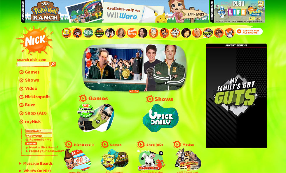
When analyzing the existing references, we understood that sites of the size we were about to take on had the quality of a Portal, so we started calling it Portal Plenarinho. The most important references were: Disney, Nick and Cartoon Network, the latter being the one that most identified with our objective.
 |  |  |

Research, Validation and Learnings
Since the website was launched, we have constantly received many evaluations of what is being delivered. Through emails and comments on posts, users have been expressing their satisfaction with the content, complaints about what was not working or even displeasing, and also ideas and suggestions for adjustments and improvements. This allowed us to understand the biggest pains and needs of our target audience, as well as their expectations and demands.
Based on this, to organize what we knew from the experience acquired and also the new objectives, we adapted the CSD Matrix tool, classifying user satisfaction as CERTAINTIES, suggestions as ASSUMPTIONS and complaints as DOUBTS.

We also distribute the next steps, transforming them into tasks and measuring them in a Prioritization Matrix (Impact - Effort).

Wireframes
Once the foundations and guidelines were established, it was time to move on to the next phase: prototyping.
We began presenting layout suggestions in wireframes. The fact that there were many images already ready before this redesign allowed us to use them to mark the spaces.
You can see the evolution of the layouts in the images below:


After more testing, we made this wireframe and with it we found the direction we wanted to go to find the final layout:

With a few adjustments, we arrived at the final layout, and we decided on the following option:

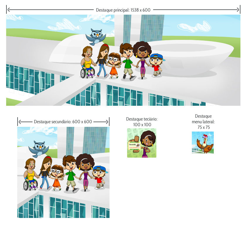
Style Guide and Design System
Once the main layout was decided, we needed to establish the visual parameters so that all subsequent pages and publications would follow the same line, so we defined the Style Guide and based on it created the Design System. Another reason for creating it was to maintain consistency and language, regardless of changes in the team.
Since the new platform already had a vast library of components, the Design System was chosen based on what was available to us, but customized to our preferences.
But before talking about the components, we need to go through two very important elements, which would be fundamental in the other decisions: the characters and the logo.
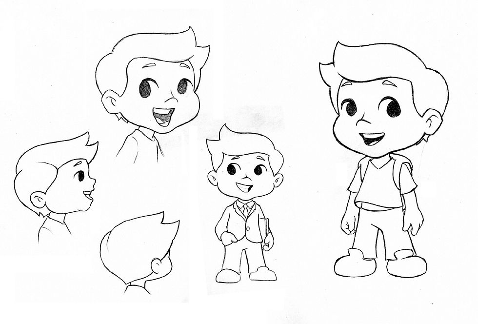
Character redesign
The characters from Turma do Plenarinho are the main foundation of the portal, they are the object of the first connection with the children and young people. They already fulfilled this role well, but since we were redesigning everything, it was the right time to update, not only the design, but also the profile of the characters and make them more interesting.

Mainly during this process, I ran several sprints leading a team of 2 designers, 1 web developer and 4 scriptwriters. |
We did an in-depth study taking into account several references. Below are some images of the creation process of the character Zé Plenarinho, who is the leader of the group.
 |  |
 |  |
 |  |
 |  |
 |  |
Logo redesign
The Plenarinho logo also has this emblematic character. The choice of rounded shapes aims to bring softness, playfulness and fluidity, so we sought to convey this feeling in a simpler and more modern way.

Just like the characters, the research and ideation work was extensive. Below are some of the suggestions that were part of this process:
 |  |  |
 |  |  |
Color palette
We defined two color palettes, one for the settings and one for the characters.
The settings' palette is predominantly pastel tones. The goal is for the setting to convey a sense of warmth and comfort, giving greater prominence to the characters.
In the characters' palette, we were concerned with listing various skin tones, encompassing the diversity of Brazilian racial classifications. Bright and cheerful colors for the clothes and accessories, also with the aim of connecting the characters to the target audience.
 |  |
Typography
Typography is used in two types of publications.
The first is the portal's texts and buttons, which use the font defined in the Style Sheets. For these, we chose Cabin Condesend, a sans serif font that is modern and friendly due to its smooth lines.

And the second, images that needed to contain text, such as highlights or supporting illustrations. Here we selected Boogaloo for titles, a more playful and fun font, and Open Sans for texts because it is a sans serif font with good readability, even at small sizes.
 |  |
Componentes, botões e textos
We used a straight finish on buttons and fill boxes to facilitate grouping and create clear white spaces. The same principle was applied to the grid, spaces between texts and their alignments.
 |  |
 |  |
Results
The transformation of the portal was more than a change of platform, but an opportunity to adapt the tools to reach their maximum potential. With this in mind, we sought to follow the recommendations of the W3C (World Wide Web Confortium).
We can see the reflection of this application in the data below, in which Google Analytics shows an increase of almost 500% in users in the period of 1 year since the publication of the new version:

Another important adjustment was the prioritization of Responsiveness. The portal became much more accessible because it was fully adaptable to any device on which it was being viewed, especially with the progressive growth in the use of browsers on cell phones. Below we have a breakdown of the information on the use of the portal via cell phone in the 1-year period since the change, the number of users in April 2017 was 322 and increased to 2,229 in April 2018:

Next steps
One of the updates that began to be implemented was the adaptation of content for digital accessibility in accordance with WCAG (Web Content Accessibility Guidelines):
Images with information that allows the use of audio description;
Subtitles in videos and animations;
Translation into LIBRAS in videos and animations.
Other products that were already part of the portal's deliveries also received an upgrade:
Câmara Mirim - The Câmara Mirim program is Plenarinho's flagship product: it provides children and teachers with the opportunity to work on drafting a bill throughout the year and experience the entire process of discussion, amendments, voting and approval, transforming the children into representatives for a day. It has always been an in-person event, but the period of social distancing due to Covid-19 led to the program being adapted to a completely virtual format, with legislative sessions held via Zoom, and later, with the end of social distancing, a hybrid version;
Plenarinho Comics - In addition to stories with the characters' new style, the adventures have become more imaginative and elaborate, exploring the evolution of their personalities. They have also been made available in digital format and users can read them online or download PDFs;
Radio soap operas and animated stories - The magazines have been expanded into these two new products;
A vez do Plenarinho - The news has gained an audio version, in partnership with Rádio Câmara in a new space in the programming called A vez do Plenarinho;
Plenacast - This program is the result of the high diffusion of audio applications (Spotify, for example), presenting articles on current affairs, in podcast format..
Conclusion and learning
Among the many lessons learned from this experience for the entire team, I would like to highlight that a good idea alone will not achieve very effective results if it is not executed with dedication, study and a search for understanding the real needs of its audience. This is what the user experience did throughout the development of this new phase of the Plenarinho Portal. By seeking to understand the target audience, we were able to enhance all aspects of the product's delivery, thus achieving growth in the number of users and greater engagement.
It is also important to remember that products like the Plenarinho Portal are never-ending, as the profile of its audience is always changing. Therefore, it is essential to constantly update yourself on their demands through research, usability tests and validations.
© 2017. All rights reserved to Leif Bessa
All | Pata amiga | Practicey | Uni-Duni-Tê | Climate Scanner | Minha grana organizada | Plenarinho 2.0 | App Sicoob