UNI-DUNI-TÊ - Responsive website for buying and selling children's clothing
- 22 de jun. de 2025
- 2 min de leitura
Atualizado: 31 de jul. de 2025

Challenge
Creation of a responsive website for parents to buy and resell children's clothing.
Main goal
Since the focus of this project is the development of a responsive website, I will not detail other processes that are important parts of the whole, such as the Research Plan, Persona Creation and Benchmarking, although all phases have received due time and attention.
Learn more about the Website by clicking here.
Production Process
Sitemap
Creating the sitemap showed me how important it is to organize the content that will be on your website, not only so that it doesn't get lost when you're implementing it, but it also helped me notice content that I thought was important and others that I hadn't even considered being part of.

Wireframes
Based on the sitemap, I made 4 sketches of the Home page to define the ideal layout.
Wireframe 1

Wireframe 2

Wireframe 3

Wireframe 4

In each of the wireframes above, I chose the elements that I liked the most and then put the final layout together into a single wireframe. I also made versions for tablets and phones. The blue line marks the fold on each device:
Desktop

Tablet

Celular

Digital wireframes
I then used the paper wireframes as a basis and created the digital wireframes of the 3 versions.
Desktop

Mobile

Tablet

Low-fidelity prototype
With the layouts created, I then wanted to test how the screen flow worked by creating a low-fidelity prototype. You can check it out by clicking here.
Mockups
After testing the prototype, it was time to transform the digital wireframes into mockups.

Design System
In projects such as websites and apps, the Design System is essential for organizing the elements, because in addition to allowing any other professional to work on the project without losing the standard, many elements, such as color palettes and buttons, are repeated across several pages, and if it is necessary to edit them, simply change them in the Style Sheet.

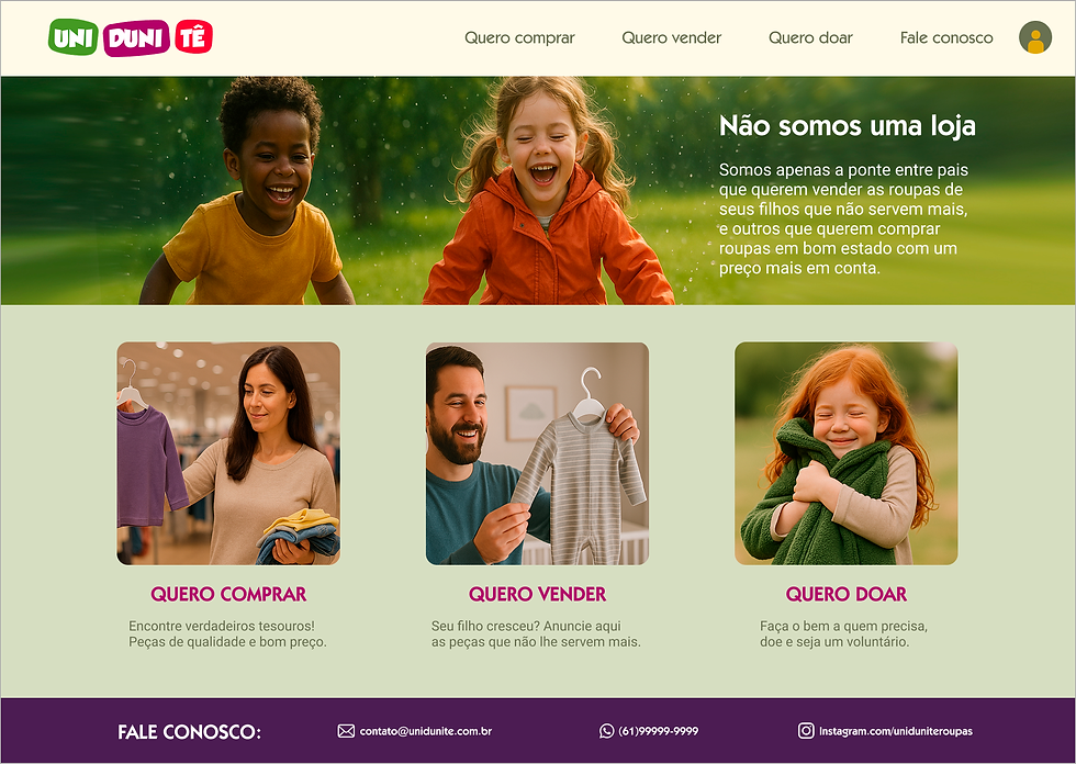
Final product
All the mockups were then assembled into the final result, a high-fidelity prototype.
Check out the Desktop version by clicking here. clicking here.

And the Mobile version by clicking here.

Web Content Accessibility Guidelines (WCAG)
A very important consideration in website development is to give due attention to accessibility, so WCAG was consulted extensively at this stage. One of the accessible markups used in this project was the Navigation Order to guide screen readers.

Final considerations
Adaptability is one of the most important concepts nowadays in projects like this, as the product needs to work well on several different devices, and this was certainly the most valuable learning while developing this project.
Once again I am grateful to the teachings of the Google UX Design course - Coursera for all the learning acquired during the development of this website.
© 2025. All rights reserved to Leif Bessa
All | Pata amiga | Practicey | Uni-Duni-Tê | Climate Scanner | Minha grana organizada | Plenarinho 2.0 | App Sicoob